
Modern web design is crucial in creating engaging and effective online experiences. As businesses and individuals strive to capture the attention of a diverse and tech-savvy audience, understanding the essential elements of modern website design becomes imperative. From responsive layouts to innovative typography, these components enhance aesthetic appeal and significantly impact user experience. This article delves into the core elements and trends defining modern web design, offering insights that can help web designers and businesses craft compelling digital presences.
What are the Core Elements of Modern Website Design?
Understanding White Space in Web Design
White space, often called negative space, is a fundamental design element in modern web design that enhances readability and overall aesthetic appeal. By strategically incorporating white space, web designers can create a sense of balance and focus that guides the user’s attention to the most essential elements of a webpage. This design technique contributes to a clean and modern look and improves user experience by reducing clutter and making content easier to digest. As website visitors increasingly seek streamlined and intuitive interfaces, the effective use of white space is an essential component of modern website design.
Where the competition for user attention is fierce, white space is an invaluable tool for web designers aiming to create a harmonious and visually appealing user interface. It allows for seamlessly integrating various website elements without overwhelming the viewer. By providing breathing room between text, images, and other components, white space enhances the overall user experience, enabling website visitors to navigate and comprehend content effortlessly. As such, mastering the art of utilizing white space is key to achieving a successful and effective web design.
The Role of Typography in Modern Websites
Typography is a cornerstone of modern web design, serving as a powerful tool for conveying brand identity and enhancing user experience. The right choice of fonts can significantly influence how website visitors perceive a brand and interact with its content. Modern website design combines classic and contemporary fonts to create a unique visual language that resonates with the target audience. Typography affects readability and plays a crucial role in establishing a brand’s voice and tone, making it an essential element in crafting a cohesive and engaging online presence.
In modern web design, typography goes beyond mere aesthetics; it’s a strategic component that shapes the overall user experience. Effective typography ensures that content is visually appealing but also accessible and legible across various devices and screen sizes. As responsive design becomes increasingly essential, web designers must consider how typography adapts to different layouts and platforms, ensuring a consistent and enjoyable user experience. By prioritizing thoughtful typography choices, websites can effectively communicate their message and leave a lasting impression on their audience.
Importance of Responsive Design for User Experience
Responsive design is critical to modern website design, ensuring that web pages adapt seamlessly to various screen sizes and devices. As the use of mobile devices continues to rise, websites need to provide a consistent and user-friendly experience across all platforms. Responsive web design involves creating flexible layouts and utilizing fluid grids, allowing content to adjust dynamically based on the user’s device. This approach enhances user experience and boosts engagement by providing easy navigation and accessibility, regardless of whether the visitor uses a desktop, tablet, or smartphone.
Incorporating responsive design principles into modern web design is no longer optional; it is necessary for businesses looking to reach a broad audience and maintain a competitive edge. A responsive website ensures users can access information quickly and efficiently without frustrating scrolling or resizing issues. Businesses can improve their search engine rankings by prioritizing responsive design, as search engines like Google favor mobile-friendly sites. Responsive design is key to delivering a positive user experience, fostering user satisfaction, and driving conversions in the digital marketplace.

How Does Navigation Influence User Experience?
Designing an Effective Navigation Menu
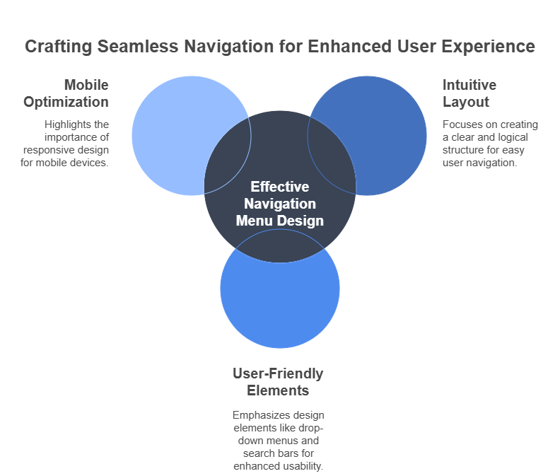
An effective navigation menu is a pivotal element of modern web design, directly impacting user experience by easily guiding visitors through the site. A well-designed navigation menu should be intuitive, allowing users to find information quickly without unnecessary clicks or confusion. This involves organizing content logically and using clear, concise labels that reflect the website’s structure. By prioritizing user-friendly navigation, web designers can enhance the overall usability of a site, ensuring that visitors can effortlessly access the content they seek, whether they’re browsing a home page or a specific landing page.
In modern web design, an effective navigation menu is a roadmap, helping users explore a website’s offerings and engage with its content meaningfully. It is essential to consider the needs and preferences of the target audience when designing a navigation menu, as this will influence how they interact with the website. Incorporating design elements such as drop-down menus, breadcrumb trails, and search bars can enhance navigation, making it more efficient and user-centric. Ultimately, a thoughtfully crafted navigation menu contributes to a positive user experience, encouraging visitors to explore the site and increasing the likelihood of conversion.
The Impact of Hamburger Menu on UX
The hamburger menu, characterized by its three horizontal lines, is a popular navigation element in modern web design, particularly for mobile devices. Its compact design allows for a clean and minimalist interface, freeing up space for content while still providing access to the full navigation menu. While some critics argue that the hamburger menu may obscure important navigation options, it remains a practical solution for accommodating complex site structures on smaller screens. When implemented thoughtfully, the hamburger menu can enhance the user experience by offering a streamlined way to explore the site without overwhelming the user with too many options.
In modern web design, hamburger menus have sparked debate, with some designers advocating for its simplicity and others cautioning against potential usability issues. Despite differing opinions, the hamburger menu remains a fixture in responsive web design, particularly for mobile-first design strategies. To maximize its effectiveness, web designers must ensure that the hamburger menu is easily recognizable and functions smoothly, providing users with a seamless navigation experience. By balancing aesthetic appeal with practical functionality, the hamburger menu can be a valuable tool in optimizing website navigation and enhancing overall user experience.
Optimizing Website Navigation for Mobile Devices
Optimizing website navigation for mobile devices is a crucial aspect of modern web design, as an increasing number of users access websites through their smartphones and tablets. Mobile-friendly navigation involves designing interfaces that are intuitive and easy to use on smaller screens, ensuring users can effortlessly find the information they need. This may include employing touch-friendly navigation elements, such as larger buttons and simplified menus, to accommodate the unique interaction patterns of mobile users. By prioritizing mobile optimization, web designers can improve user experience, reduce bounce rates, and increase the likelihood of conversion on mobile devices.
In modern web design, optimizing website navigation for mobile devices is no longer a luxury but a necessity. As mobile usage continues to grow, users expect seamless and efficient navigation experiences, regardless of their device. Web designers must consider screen size, touch interaction, and loading speed when crafting mobile-friendly navigation. Implementing responsive design principles and mobile-first strategies can ensure that navigation elements are accessible and functional on all devices, enhancing user satisfaction and driving engagement. Ultimately, optimizing website navigation for mobile devices is key to capturing and retaining the attention of an increasingly mobile audience.
What are the Latest Web Design Trends to Watch?
Exploring Minimalist Design Trends
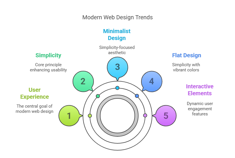
Minimalist design is a prominent trend in modern web design, characterized by its focus on simplicity, clean lines, and a clutter-free aesthetic. This design approach emphasizes negative space, limited color palettes, and essential elements only, creating a visually appealing and easy-to-navigate user interface. By eliminating unnecessary distractions, minimalist design allows users to focus on the content and engage more deeply with the website’s offerings. As users increasingly seek streamlined and efficient online experiences, minimalist design continues gaining popularity, shaping modern website design’s future.
In the context of modern web design, minimalist design trends offer a refreshing departure from overly complex and cluttered interfaces. This approach aligns with the principles of effective web design, prioritizing user experience and ease of navigation. By focusing on the core elements of a website and removing extraneous features, minimalist design enhances the overall usability and accessibility of a site. As web designers embrace minimalism, they create digital experiences that are not only visually striking but also functional and user-friendly, meeting the evolving expectations of today’s website visitors.
The Rise of Flat Design in Modern Web Design
Flat design has emerged as a significant trend in modern web design, characterized by its use of two-dimensional elements, vibrant colors, and straightforward typography. This design style rejects complex textures and gradients, favoring a clean, straightforward aesthetic that enhances usability and performance. Flat design is particularly well-suited for responsive and mobile-first design, as its simplicity translates well across various screen sizes and devices. By adopting flat design principles, web designers can create visually appealing and functional websites that resonate with users and align with contemporary design preferences.
In modern web design, the rise of flat design reflects a shift towards more user-centric and efficient digital experiences. This design approach is rooted in the belief that form follows function, prioritizing usability and accessibility over decorative embellishments. Flat design’s emphasis on simplicity and clarity extends to its impact on page load times, contributing to faster and more responsive websites. As users demand seamless and intuitive interactions, flat design remains popular for web designers seeking to create an engaging and effective online presence.
Incorporating Interactive Elements into Webpages
Interactive elements have become a defining feature of modern web design, offering dynamic and engaging experiences that captivate users and encourage exploration. These elements, from animations and hover effects to interactive forms and videos, add a layer of interactivity that enhances user engagement and retention. By incorporating interactive features, web designers can create immersive digital experiences that resonate with users and encourage them to interact more deeply with the content. As web design continues to evolve, interactive elements represent a key trend that shapes how users interact with modern websites.
Incorporating interactive elements into webpages is a powerful strategy for enhancing user experience and driving engagement in modern web design. These elements capture user attention and provide opportunities for personalization and customization, allowing users to tailor their interactions to their preferences. Whether through gamification, quizzes, or interactive storytelling, interactive features create memorable experiences that leave a lasting impression on website visitors. As the demand for more dynamic and engaging online experiences grows, incorporating interactive elements becomes essential to successful modern web design.
How to Optimize a Website for Better Performance?
Addressing Slow-Loading Website Issues
Slow-loading websites is a significant concern in modern web design, as it can lead to increased bounce rates and decreased user satisfaction. To address these issues, web designers must prioritize optimizing page load times, ensuring content is delivered quickly and efficiently. This involves compressing images, minimizing HTTP requests, and leveraging browser caching to reduce load times. By addressing slow-loading website issues, businesses can enhance user experience, improve SEO rankings, and ultimately increase conversions, making website performance optimization a critical consideration in modern web design.
In the competitive landscape of modern web design, addressing slow-loading website issues is crucial for maintaining user engagement and driving business success. Users expect fast and seamless interactions, and any delays in loading can result in frustration and abandonment. Web designers must employ various strategies to optimize website performance, from optimizing server response times to implementing content delivery networks (CDNs). By focusing on speed and efficiency, businesses can create responsive and user-friendly websites that meet the demands of today’s fast-paced digital environment, ensuring a positive experience for all users.
Ensuring Compatibility Across Different Browsers
Ensuring compatibility across different browsers is a fundamental aspect of modern web design, as users access websites through a variety of platforms with distinct capabilities. To achieve cross-browser compatibility, web designers must test and adapt their designs to function seamlessly on popular browsers such as Chrome, Firefox, Safari, and Edge. This involves using standardized coding practices, validating HTML and CSS, and addressing browser-specific quirks to ensure a consistent experience for all users. By prioritizing compatibility, web designers can reach a wider audience and provide a reliable and accessible user experience, regardless of the browser used.
In modern web design, ensuring compatibility across different browsers is essential for delivering a cohesive and functional user experience. With many browsers available, each with its rendering engines and features, web designers face the challenge of creating designs that work uniformly across platforms. This requires thorough testing and debugging to identify and resolve compatibility issues, ensuring website elements appear and function as intended. By investing in cross-browser compatibility, businesses can avoid alienating potential users and ensure their digital presence is accessible and appealing to a diverse audience.
Techniques for SEO Optimization
SEO optimization is a cornerstone of modern web design, playing a vital role in increasing a website’s visibility and driving organic traffic. Effective SEO strategies involve optimizing website elements, including meta tags, headers, and content, to align with search engine algorithms and improve rankings. Web designers must also prioritize website speed, mobile-friendliness, and user experience, as these elements contribute to overall SEO performance. By implementing SEO optimization techniques, businesses can enhance their online presence, attract more visitors, and achieve greater success in the competitive digital landscape.
In the context of modern web design, mastering SEO optimization techniques is crucial for businesses looking to maximize their online reach and visibility. Search engines consider numerous factors when ranking websites, and web designers must stay informed of the latest SEO trends and best practices to remain competitive. This includes conducting keyword research, optimizing on-page elements, and building quality backlinks to boost search engine performance. By prioritizing SEO optimization, businesses can improve their website’s search engine rankings, increase organic traffic, and ultimately achieve their digital marketing goals, making it an essential aspect of successful web design.

Why is Layout Important in Web Design?
Creating an Effective Grid Design
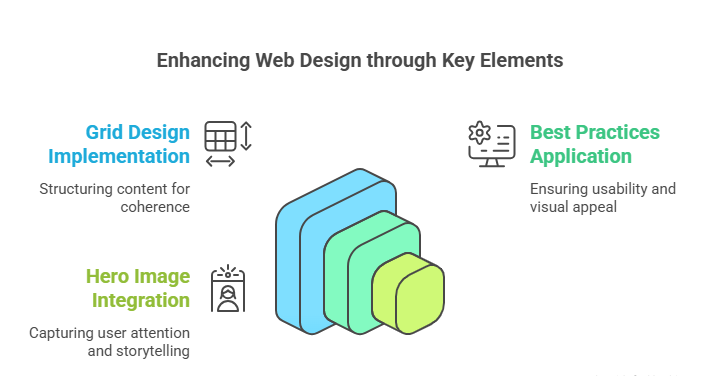
Grid design is a fundamental aspect of modern web design, providing a structured framework that organizes content and enhances visual coherence. Using a grid system, web designers can create balanced, harmonious layouts that guide the user’s eye and improve readability. This design approach ensures that elements are aligned and proportionate, contributing to a professional and polished appearance. An effective grid design not only enhances the aesthetic appeal of a website but also improves usability and user experience, making it an essential element of modern web design.
In modern web design, creating an effective grid design is essential for achieving a visually appealing and functional layout. Grids provide a flexible structure that adapts to different screen sizes and devices, supporting responsive design principles and ensuring a consistent platform experience. Grids facilitate easy navigation and improve the overall user experience by organizing content into clear and logical sections. As web designers embrace grid design, they can create cohesive and engaging digital experiences that resonate with users and meet the demands of contemporary web design trends.
Best Practices for Website Layout
Best practices for website layout are essential guidelines for creating user-friendly and visually appealing web designs. A well-structured layout enhances usability by organizing content clearly and logically, allowing users to navigate the site effortlessly. This involves prioritizing key elements, such as navigation menus, call-to-action buttons, and visual hierarchy, to effectively guide users through the site. By adhering to best practices for website layout, web designers can create engaging and intuitive digital experiences that meet the needs and expectations of their target audience.
In modern web design, following best practices for website layout is crucial for delivering a seamless and enjoyable user experience. This includes optimizing for responsive design, ensuring cross-browser compatibility, and maintaining a consistent visual identity throughout the site. By prioritizing these best practices, web designers can create cohesive and functional layouts that enhance user engagement and satisfaction. Ultimately, a well-executed website layout is a key factor in the success of modern web design, contributing to a positive and memorable user experience.
Utilizing Hero Image to Tell a Story
The hero image is a powerful design element in modern web design, serving as a visual focal point that captures the user’s attention and sets the tone for the site. By utilizing a hero image effectively, web designers can convey a brand’s story and message compellingly and impactfully. This prominent image, often placed at the top of a webpage, provides an opportunity to showcase a brand’s identity and values, engaging users from the moment they land on the site. As a key component of modern web design, the hero image is crucial in creating an immersive and memorable user experience.
Incorporating a hero image into modern web design is a strategic approach to storytelling, allowing brands to communicate their message visually and emotionally. A well-chosen hero image can evoke feelings and connections, drawing users into the site and encouraging them to explore further. The hero image is a powerful tool for creating a lasting impression on website visitors by aligning with the brand’s identity and using high-quality visuals. As web designers continue to prioritize visual storytelling, the hero image remains a vital element in crafting engaging and compelling digital experiences.